
Introduction
More people use smartphones to browse the internet than ever before. For businesses, this means having a mobile-friendly website is no longer optional.
A website that works well on smartphones provides a better user experience, helps visitors find information quickly, and can support better search visibility.
If visitors have to zoom in, scroll horizontally, or struggle to click buttons, they may leave your website and choose a competitor instead.
In this guide, we’ll explain how to make a website mobile friendly and the key improvements you should consider.
What Is a Mobile-Friendly Website?
A mobile-friendly website is designed to work properly on smartphones and other smaller screens.
A mobile-friendly website should:
- Adjust to different screen sizes
- Have readable text
- Use easy-to-tap buttons
- Load quickly
- Have simple navigation
- Display images correctly
- Make forms easy to complete
- Avoid horizontal scrolling
This is commonly achieved through responsive web design.
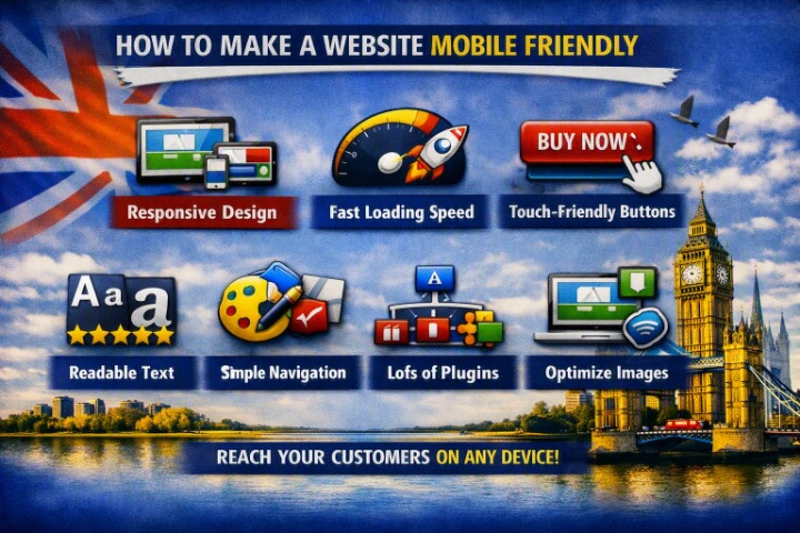
1. Use Responsive Web Design
Responsive web design allows your website layout to automatically adapt to the visitor’s screen size.
Instead of creating completely separate websites for desktop and mobile, responsive design uses flexible layouts that adjust to different devices.
Your website should work smoothly on:
- Smartphones
- Tablets
- Laptops
- Desktop computers
Responsive design should be considered from the beginning of the website development process.
2. Make Text Easy to Read
Small text can make mobile websites difficult to use.
Avoid forcing visitors to zoom in to read your content.
Use:
- Comfortable font sizes
- Clear typography
- Adequate line spacing
- Strong contrast
- Short paragraphs
Break large blocks of text into smaller sections so visitors can scan your content easily.
3. Make Buttons Easy to Tap
Buttons and links need enough space around them for users to tap comfortably.
Avoid placing multiple small links directly next to each other.
Important mobile CTAs might include:
- Call Now
- Get a Quote
- Contact Us
- Book Now
- Buy Now
Make these actions visually clear and easy to access.
4. Simplify Your Navigation
Desktop navigation menus can contain many options, but they don’t always work well on mobile screens.
Use a simple mobile menu, often represented by a hamburger icon.
Keep the most important pages easy to access, such as:
- Home
- Services
- About
- Products
- Contact
Avoid unnecessarily complicated dropdown menus.
5. Optimize Images for Mobile
Large images can make mobile websites slow.
Before uploading images:
- Resize them appropriately
- Compress them
- Use modern formats such as WebP or AVIF where appropriate
- Avoid unnecessarily high-resolution images
- Use responsive image sizes
A large desktop image shouldn’t automatically be downloaded at its full size on a smartphone.
6. Improve Website Loading Speed
Mobile users may browse on slower connections, so performance is especially important.
Improve loading speed by:
- Compressing images
- Using caching
- Optimizing CSS
- Reducing JavaScript
- Choosing reliable hosting
- Using a CDN where appropriate
- Removing unnecessary plugins and scripts
Focus on the content users need first and avoid loading unnecessary resources.
7. Avoid Horizontal Scrolling
Visitors shouldn’t have to swipe from left to right to see your website.
Horizontal scrolling is often caused by:
- Fixed-width elements
- Oversized images
- Tables
- Large forms
- Poorly designed layouts
- Elements extending beyond the viewport
Test every page on different screen sizes to identify these problems.
8. Make Forms Mobile-Friendly
Forms can be difficult to complete on smartphones if they’re poorly designed.
Keep forms simple and use:
- Clear labels
- Large input fields
- Appropriate input types
- Easy-to-use dropdowns
- Minimal required fields
For example, a simple contact form may only need:
- Name
- Phone
- Message
Only ask for information that is necessary.
9. Use Mobile-Friendly Pop-Ups
Pop-ups can be particularly frustrating on small screens.
If you use pop-ups, make sure visitors can:
- Easily read them
- Close them
- Interact with buttons
- Complete the intended action
Don’t allow a pop-up to cover the entire screen or make it difficult to return to the page.
10. Make Your Phone Number Clickable
If your business receives phone enquiries, make your phone number easy to use on mobile.
Visitors should be able to tap the number and call directly.
A prominent Call Now button can be particularly useful for local businesses and service providers.
11. Make Your Content Easy to Scan
Mobile users often scan rather than read every word.
Improve readability by using:
- Short paragraphs
- Headings
- Bullet points
- Lists
- Highlighted important information
- Clear sections
Avoid large walls of text.
A well-structured page makes it easier for visitors to find what they’re looking for.
12. Optimize Videos
Videos can consume significant bandwidth and slow down mobile pages.
Consider:
- Compressing videos
- Using appropriate video formats
- Avoiding unnecessary autoplay
- Using a thumbnail instead of immediately loading a large video
- Hosting videos on a suitable platform when appropriate
Only use video when it genuinely improves the user experience.
13. Check Your Mobile Page Layout
Important information should appear in a logical order.
For example, a service page could follow this structure:
- Service headline
- Main benefit
- Short explanation
- Key features
- Testimonials
- FAQs
- Call to action
Don’t force mobile visitors to scroll through unnecessary sections before finding the information they need.
14. Optimize Your Website for Touch
Mobile users interact with websites using their fingers rather than a mouse.
Make sure:
- Buttons are large enough
- Links have enough spacing
- Menus are easy to open
- Form fields are easy to select
- Interactive elements aren’t too close together
A touch-friendly interface reduces accidental clicks and improves usability.
15. Use Mobile-Friendly Fonts
Some fonts look attractive on large desktop screens but become difficult to read on smartphones.
Choose fonts that remain clear at smaller sizes.
Also avoid loading too many font families and weights because they can increase page load time.
16. Test Your Website on Real Devices
Don’t rely only on a desktop browser.
Test your website on:
- Android phones
- iPhones
- Tablets
- Different screen sizes
Check:
- Navigation
- Forms
- Buttons
- Images
- Page speed
- Text size
- Checkout
- Contact options
Real-device testing can reveal problems that aren’t obvious on a desktop.
17. Check Mobile SEO
Mobile usability is an important part of modern SEO and user experience.
Make sure your mobile website has:
- The same important content as desktop
- Proper headings
- Search-friendly URLs
- Optimized images
- Fast loading performance
- Good internal linking
- Accessible content
Avoid hiding important information from mobile users simply to make pages shorter.
18. Use a Mobile-Friendly CMS or Theme
If you’re using WordPress, choose a responsive theme or properly developed custom design.
Page builders can also create responsive layouts, but you should always test the final website rather than assuming every element will automatically work perfectly on mobile.
Keep plugins and themes updated and remove unnecessary functionality that could affect performance.
Mobile-Friendly Website Checklist
Before launching your website, check:
- Responsive design
- Readable text
- Large, easy-to-tap buttons
- Simple mobile navigation
- Optimized images
- Fast loading speed
- No horizontal scrolling
- Mobile-friendly forms
- Easy-to-close pop-ups
- Clickable phone numbers
- Easy-to-scan content
- Optimized videos
- Touch-friendly elements
- Mobile-friendly fonts
- Testing on real devices
- Mobile SEO optimization
Common Mobile Website Mistakes
Avoid these common problems:
Tiny text
Visitors shouldn’t need to zoom in.
Small buttons
Buttons that are difficult to tap can frustrate users.
Slow pages
Large images, scripts, and videos can significantly increase loading times.
Complicated menus
Mobile navigation should be simple and predictable.
Horizontal scrolling
Content should fit naturally within the screen.
Too many pop-ups
Aggressive pop-ups can interrupt the mobile experience.
Desktop-first thinking
Don’t simply shrink a desktop website. Design the experience around how mobile users actually interact with your site.
How to Test if Your Website Is Mobile Friendly
You can manually test your website by opening it on different smartphones and tablets.
You should also use browser developer tools to test different screen sizes and review performance tools that measure mobile loading and user experience.
Pay particular attention to:
- Layout
- Navigation
- Readability
- Touch interactions
- Loading performance
- Core Web Vitals
Fix the most important problems first rather than trying to optimize every minor detail.
Final Thoughts
Making a website mobile friendly is about more than simply making the desktop layout smaller.
A successful mobile website should be responsive, fast, readable, easy to navigate, touch-friendly, and focused on the user’s needs.
Start by implementing responsive design, optimizing images, simplifying navigation, improving page speed, and making forms and CTAs easy to use.
Then test your website on real devices and continue improving it based on user behaviour and performance data.
A mobile-friendly website can provide a better customer experience, reduce frustration, and help your business turn more mobile visitors into customers.
Frequently Asked Questions
What makes a website mobile friendly?
A mobile-friendly website adapts to different screen sizes, loads quickly, uses readable text, provides touch-friendly buttons, and makes navigation and forms easy to use on smartphones.
How can I make my WordPress website mobile friendly?
Use a responsive WordPress theme or design, optimize images, simplify mobile navigation, test page layouts, improve performance, and make sure forms and buttons work properly on smartphones.
Is responsive design the same as mobile-friendly design?
Responsive design is one of the main techniques used to create mobile-friendly websites. It allows the layout to adapt automatically to different screen sizes.
Why is my website not mobile friendly?
Common causes include fixed-width layouts, oversized images, small text, poorly designed menus, non-responsive themes, and elements that extend beyond the mobile screen.
Does mobile-friendly design help SEO?
Yes. Mobile usability and page experience are important considerations for modern websites. A good mobile experience can also improve engagement and make it easier for visitors to use your site.
Should I create a separate mobile website?
Usually, a responsive website is the preferred approach because one website can adapt to different devices. Separate mobile websites can create additional maintenance and SEO complexity.