
Introduction
In today’s digital world, people browse websites on a wide range of devices, including smartphones, tablets, laptops, and desktop computers. If your website doesn’t adapt to different screen sizes, visitors may struggle to navigate, read content, or complete important actions like making a purchase or filling out a contact form.
This is where responsive web design becomes essential. A responsive website automatically adjusts its layout, images, and content to provide the best possible experience on every device.
In this article, you’ll learn what responsive web design is, why it matters, its key benefits, and why every modern business website should be responsive.
What Is Responsive Web Design?
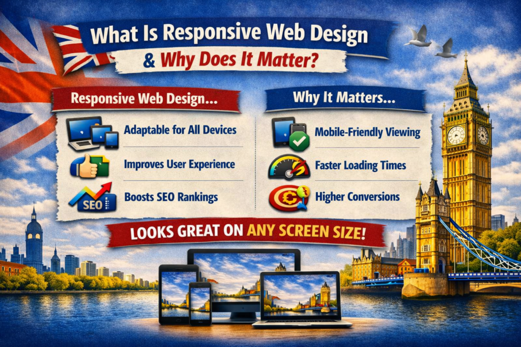
Responsive web design is a web development approach that allows a website to automatically adjust its layout and content based on the visitor’s screen size and device.
Instead of creating separate websites for desktop and mobile users, a responsive website uses flexible layouts, scalable images, and CSS media queries to ensure the site looks and functions well on all devices.
Whether someone visits your website from a smartphone, tablet, laptop, or large desktop monitor, they receive an optimized viewing experience.
How Responsive Web Design Works
Responsive websites use several techniques to adapt to different screen sizes, including:
- Flexible grid layouts
- Fluid images that resize automatically
- CSS media queries
- Responsive typography
- Adaptive navigation menus
- Flexible spacing and containers
These elements work together to create a seamless browsing experience without requiring users to zoom or scroll horizontally.
Why Responsive Web Design Matters
A responsive website is no longer optional—it’s an essential part of building a successful online presence.
Here are the key reasons why responsive web design matters.
1. Better User Experience
Visitors expect websites to be easy to use regardless of the device they’re using.
Responsive design improves:
- Readability
- Navigation
- Button accessibility
- Page layout
- Overall usability
A positive user experience encourages visitors to stay longer and interact with your content.
2. Mobile Traffic Continues to Grow
A significant portion of internet users now browse primarily on mobile devices.
If your website isn’t mobile-friendly, you risk losing potential customers who may leave and visit a competitor with a better mobile experience.
Responsive design ensures your website serves all visitors effectively.
3. Improved SEO Performance
Search engines favor websites that provide a good user experience across all devices.
Responsive web design contributes to SEO by improving:
- Mobile usability
- Page speed
- User engagement
- Crawl efficiency
- Reduced duplicate content
A single responsive website is generally easier to optimize than maintaining separate desktop and mobile versions.
4. Faster Website Management
With responsive design, you only manage one website instead of maintaining separate versions for desktop and mobile users.
This simplifies:
- Content updates
- Design changes
- SEO management
- Security updates
- Website maintenance
Managing one responsive website saves time and reduces costs.
5. Higher Conversion Rates
When visitors can easily browse your website and complete actions on any device, they’re more likely to become customers.
Responsive websites often improve:
- Contact form submissions
- Online purchases
- Appointment bookings
- Newsletter signups
- Phone calls
A smoother user journey leads to better business results.
6. Faster Page Loading
Modern responsive websites are often optimized for performance.
Developers can improve loading speed through:
- Optimized images
- Efficient code
- Browser caching
- Responsive image loading
- Minified CSS and JavaScript
Faster websites create a better experience and support stronger search rankings.
7. Increased Customer Trust
A professional, mobile-friendly website creates a positive first impression.
Visitors are more likely to trust businesses whose websites:
- Look modern
- Work smoothly
- Load quickly
- Display correctly on all devices
An outdated or broken mobile experience can reduce credibility.
Key Features of Responsive Web Design
A responsive website typically includes:
- Flexible layouts
- Mobile-friendly navigation
- Responsive images
- Readable text without zooming
- Touch-friendly buttons
- Fast loading pages
- Cross-browser compatibility
- Consistent branding across devices
These features ensure users enjoy a consistent experience wherever they access your site.
Responsive Design vs Mobile Website
Many people confuse responsive websites with separate mobile websites.
| Responsive Website | Separate Mobile Website |
|---|---|
| One website for all devices | Separate desktop and mobile versions |
| Easier to maintain | Requires managing two websites |
| Better SEO | More complex SEO management |
| Consistent user experience | Different experiences across devices |
| Cost-effective long term | Higher maintenance costs |
For most businesses, responsive design is the preferred approach.
Industries That Benefit from Responsive Web Design
Almost every business can benefit from a responsive website, including:
- Small businesses
- Ecommerce stores
- Restaurants
- Healthcare providers
- Law firms
- Real estate agencies
- Educational institutions
- Financial services
- Non-profit organizations
- Professional service providers
No matter the industry, customers expect websites to function well on every device.
Best Practices for Responsive Web Design
To create an effective responsive website:
- Use a mobile-first design approach.
- Optimize images for faster loading.
- Keep navigation simple and intuitive.
- Use readable font sizes.
- Ensure buttons are easy to tap.
- Test on multiple screen sizes.
- Improve page speed.
- Avoid intrusive pop-ups on mobile devices.
- Maintain consistent branding.
- Regularly review and update your website.
Following these practices helps provide the best possible experience for users.
Common Mistakes to Avoid
When designing a responsive website, avoid:
- Tiny text that’s difficult to read
- Buttons placed too close together
- Large images that slow loading speed
- Horizontal scrolling
- Unoptimized mobile navigation
- Ignoring tablet users
- Failing to test on real devices
Addressing these issues improves usability and customer satisfaction.
Final Thoughts
Responsive web design is one of the most important elements of a successful modern website. It ensures your website looks great, performs well, and provides a seamless experience across smartphones, tablets, laptops, and desktop computers.
For businesses, responsive design isn’t just about appearance—it’s about improving customer satisfaction, increasing conversions, strengthening SEO, and staying competitive in an increasingly mobile-first world.
If your website isn’t responsive yet, investing in a responsive redesign can deliver long-term benefits for both your visitors and your business.
Frequently Asked Questions (FAQs)
What is responsive web design?
Responsive web design is an approach that allows a website to automatically adapt its layout and content to different screen sizes and devices, providing an optimal user experience.
Why is responsive web design important?
It improves usability, supports better SEO, increases customer engagement, and ensures your website works well on smartphones, tablets, laptops, and desktops.
Does responsive design improve SEO?
Yes. Responsive websites generally provide better mobile usability, faster loading times, and improved user experience, all of which can positively impact search engine rankings.
Is responsive design the same as a mobile website?
No. A responsive website uses a single design that adapts to all devices, while a mobile website is often a separate version created specifically for mobile users.
Can an existing website be made responsive?
Yes. Most existing websites can be redesigned or updated to become responsive, although the amount of work required depends on the site’s current structure and technology.